Product photography and the psychology of colors; how you can use colors to influence buyers?
Colors are powerful tools that can influence our emotions and decisions. In the world of product photography, choosing the right colors can make the difference between capturing buyers’ attention or driving them away. Let’s explore how you can use the psychology of colors to influence buyers to choose your products.


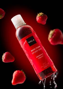
- Red for Impact: Red is a powerful color that evokes intense emotions. It’s the color of passion, energy, and emergency. Therefore, using red can be highly effective when you want to grab attention for a product or create a sense of urgency among buyers. For example, if you’re selling products in a discount or special promotions campaign, using red in images or design elements can emphasize that it’s an opportunity not to be missed.
- Blue for Trust: Blue is the color of trust and stability. It’s often associated with brands that want to convey the idea of quality and reliability. When you want to highlight that your product is trustworthy and of high quality, blue can be an excellent choice. For instance, when photographing tech products or healthcare-related items, using blue can suggest that these products are safe and reliable.

- Green for Nature and Eco-Friendly: Green is the color of nature, freshness, and sustainability. It’s a suitable choice for eco-friendly products or those related to the environment. For example, if you’re selling organic products, natural cosmetics, or gardening supplies, using green colors in your photos can underline that these products are environmentally friendly.

- Light Color Palette for Simplicity: Light colors, such as white, cream, or pastels, can create a sense of simplicity and elegance. These colors are suitable for products with minimalist design or to emphasize clarity. For example, if you’re marketing beauty products or personal care items, using light colors in your images can highlight the purity and refinement of these products.
- Contrast and Harmony: Colors can also be used in combinations to create contrast or harmony. Well-chosen contrast can make products stand out in images, while harmony can convey a sense of balance and cohesion. For example, you can use a complementary color scheme, like red and green, to create a strong contrast in your images, or you can use similar shades of blue and turquoise to create a pleasing harmony.
In photography, colors are not just beautiful shades but powerful tools for communicating with buyers. By choosing the right colors, you can transform product images into selling artworks, capturing the attention and trust of buyers.